Visualizing multivariate data is notoriously difficult. The methods which are commonly used can be very valuable, but have significant drawbacks. To mention a few:
- The number of plots needed in scatter plot matrices grows fast with the number of data dimensions.
- Radar charts and parallel coordinates: It’s not easy to remember which visual feature belongs to which data variable and as a result they are hard to read.
- Dimension reduction (like PCA or t-SNE): The underlying mathematics and algorithms are difficult to understand for people without substantial mathematical training. As a result, the properties, limits and drawbacks of the method are often poorly understood and results may be misinterpreted. Some, like t-SNE, need hyperparameters which can be difficult to choose properly.
Our dream is to understand our high dimensional data from a single image. And this without significant loss, need for hyperparameters and in an intuitive and easy to interpret way.
So what are our options?
Of course we need to mention Chernoff faces here, which display data in the shape of a human face:
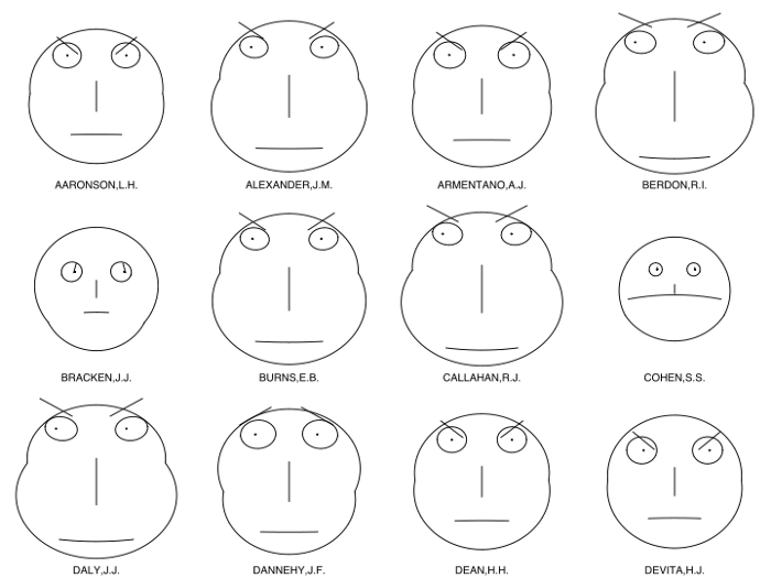
But because of their known problems, Chernoff faces are rarely used in practice (see the references at the end for in depth discussions).
There are attempts to improve the Chernoff system while still using faces to visualize data (e.g. the ‘empathic visualization algorithm’ EVA, see references). But even when the mapping between the data and the emotions evoked by the corresponding glyphs is generally correct, there can be traps: What if a face glyph reminds you of your uncle, who used to blow the smoke of his cigar into your face when you were a child? You might unconsciously dislike the glyph and the corresponding data. The problem is: we care very much about people and our perception of faces depends on our personal experiences and therefore varies from person to person.
How can we choose more suitable objects to design glyphs from?
An good complex metaphoric glyph has the following properties:
- The human eye should be already well trained in perceiving variations of the glyphs shape. This is the case for objects which play a significant role in our live (like faces).
- The object the glyph resembles should not carry strong emotions (faces unfortunately sometimes do).
- The object should show a large number of distinguishable visual features which can be mapped to data variables (true for faces).
It would be desirable to create a glyph which is perfectly matching the data to be visualized. This is often nicely realized in static information graphics (e.g. using car glyphs to visualize car technical data). But when designing complex metaphoric glyphs for data exploration, we face significant conceptual and technical challenges:
- Visual features should be independent: if one feature is changed, the others should be affected as little as possible. In practice, it is not easy to design complex glyphs with fully independent features.
- There should be not too much variation in the visual dominance of the different features. If a feature is visually much more dominant than others, the observer pays more attention to the variables associated with this feature. Again it is very hard to avoid this completely in practice (Chernoff faces: the mouth is much more dominant than the eyebrows).
- Extreme values of a feature should not hide other features or make them much more or less dominant. Also very difficult to achieve.
- The rendering of glyphs requires a system for procedural modeling. This is technically more challenging than the creation of common charts. Each glyph must be coded and tested with a large number of parameter combinations.
Therefore designing, implementing and testing a new glyph requires considerable efforts, which are beyond the possibilities of most users. This means that universal glyphs (like the Chernoff faces), which work well for a large number of problems, are often the only realistic option. Now we have an additional requirement for the choice of the object:
- It should be easy to create mnemonics to remember the mapping of visual features to data variables. This should work for many different variables from various fields of human activity. This is the case for objects which play a role in many different contexts of our live. They must have a rich cultural history which allows us to attribute meaning to their visual features in many different ways.
As the mapping of visual features to data variables has to be defined and learned (using the mnemonics) for each data set, these universal glyphs are not suitable for information graphics where the visualization needs to be understood very quickly and without explanation. But for data exploration purposes where the user spends sometimes several hours with the data, they work surprisingly well: The mnemonics are needed only during the first ten minutes of exploration and the visualization becomes intuitive later on. It is important to understand this difference: it is usually not a good idea to include a screenshot of a complex glyph based data exploration tool like curios.IT into a report (this also because of occlusion problems, as we will see below).
After experimenting with many different glyphs, we found trees to work well in many cases. Trees are very important for us, as we use them already for ages as landmarks to navigate in our environment. Although we are very familiar with trees, we are relatively unemotional about them (they are not potential mates, friends or enemies and are food source only in special cases).
When designing the curios.IT data exploration software, we chose to show the trees in a 3D environment rendered by a game engine. This offers several advantages:
- The additional dimension (compared to 2D) allows to show more visual features (we usually need several 2D projections of a 3D object to see all of its features).
- Game engines can display animations, which can be used to add even more visual features.
- Glyphs can be placed on a terrain, which can be used to show metadata (like the number of records in a cluster or the cluster variance).
In our early experiments we tried, excited from the almost infinite possibilities of the game engine, to draw the trees in a rather realistic way (branches with leaves, nice fruits etc.). But for some innocent data set, the result looked like a still from a dystopian movie (the scene just after the nuclear blast):
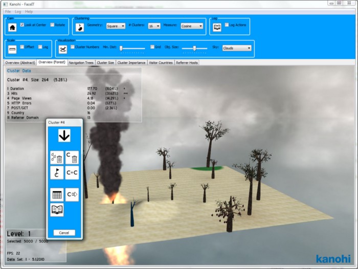
We realized that even for trees, a more abstract representation works much better. In performing arts theory this is known as the estrangement or v-effect (coined by the German playwright and theater director Bertolt Brecht): Too much realism should be avoided to make sure the observer does not get emotional and keeps distance to what he experiences. Data should, even when visualized with metaphors, be assessed with the rational mind.
How to use complex 3D glyphs?
Complex 3D glyphs are not well suited for the visualization of large numbers of individual records. When showing more than about 20 glyphs, occlusion becomes a serious problem. Its not possible to make the glyphs very small, because this makes their features difficult to see. One solution which works well in practice, is to use them in combination with clustering: instead of showing the whole data set, a small number of representative cluster centroids is visualized:
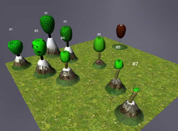
Any method to split the data set into a small number of groups (around 10) will help (e.g. grouping by categories etc.). But even then, it is often necessary look at the visualization from different angles. Furthermore, some visual features of the glyphs might be well visible only from certain angles. Therefore the user should be given the possibility to rotate the visualization easily. This again means that static screenshots (like in a report) of 3D glyph visualizations don’t work well and are a poor replacement for playing with the data in an interactive environment.
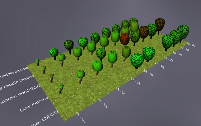
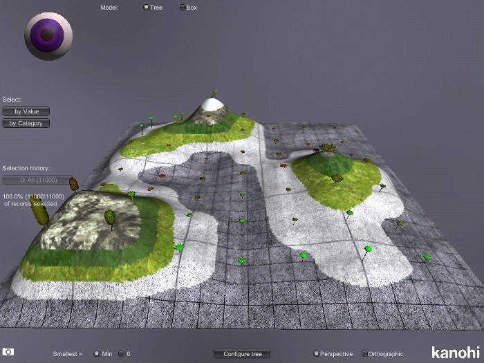
Complex metaphoric 3D glyphs can be combined with more sophisticated data mining methods. For instance, self-organizing maps (SOM) are normally visualized by showing a color coded map for every data dimension (and the unified distance matrix):
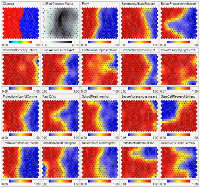
Complex 3D glyphs allow us to combine many such maps into a single one (with the terrain height used to display the U-matrix):
Conclusions:
Visualization of multivariate data with complex metaphoric 3D glyphs is challenging and the results are usually far from perfect. But we believe that such methods can be a valuable addition to the data scientists toolbox when exploring such data interactively. For users without strong mathematical background, they are easier to master than dimension reduction. The method is rarely useful for reporting and publications. Further reading and references:
curios.IT® data exploration software
https://kanohi.ch/data_exploration_solutions/
A Critique of Chernoff Faces
https://eagereyes.org/criticism/chernoff-faces
The Trouble with Chernoff
http://maphugger.com/post/44499755749/the-trouble-with-chernoff
The Empathic Visualisation Algorithm: Chernoff Faces Revisited http://www0.cs.ucl.ac.uk/staff/a.loizides/218.pdf
REEFSOM — A Metaphoric Data Display for Exploratory Data Mining
https://pub.uni-bielefeld.de/publication/2714075
Leaf Glyphs: Story Telling and Data Analysis Using Environmental Data Glyph Metaphors
https://link.springer.com/chapter/10.1007/978-3-319-29971-6_7
Chernoff faces image and SOM visualization from Wikipedia
curios.IT images © author
Follow me on X to get informed about new content on this blog.
